Intervening in the visual identity of a municipality with a dense historical legacy is, above all, an exercise in restraint and responsibility. When a territory possesses a living root and a deep-rooted heritage, strategic design should not seek the spotlight or add cosmetic layers. Its primary function is to order, clarify, and give continuity to what already exists.
When approaching the Cangas de Onís identity project, the starting point required understanding that a public institution does not compete in the market of fast-moving consumer brands. A town council does not need a purely ornamental narrative or a graphic proposal that acts as a tourist souvenir. What it requires is a solid visual system, an anchor capable of responding with the same reliability to the needs of administrative management and the projection of its geographical and cultural reality.
Strategic design at the service of the community
The response to place branding projects does not lie in the search for novelty, but in judgement. An institutional brand must be conceived as a long-term asset, capable of organising the daily relationship between an administration and its citizens.
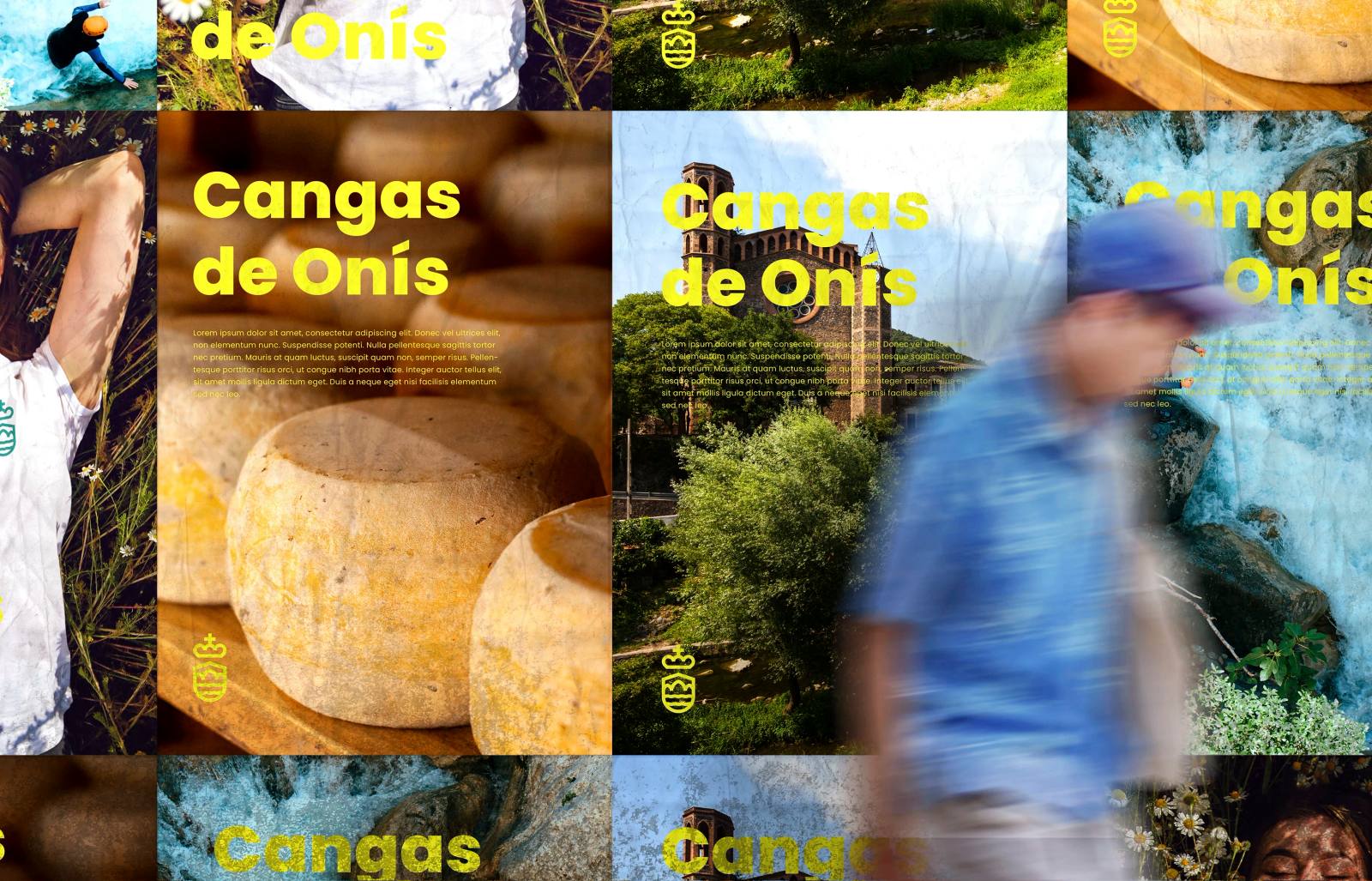
Therefore, the development of the graphic universe for Cangas de Onís focused on typographic solidity and an art direction designed to coexist with mediums of highly diverse natures. The resulting visual language is designed to function with identical naturalness in institutional and physical scenarios:
- The sobriety and rigour required by an official document or a printed municipal notice.
- The clarity and accessibility required in digital environments and town council platforms.
- The durability and visual coexistence of signage exposed to the natural landscape of the territory.
Judgement and temporality in the visual identity of municipalities
Working for heritage necessarily implies thinking about time and assuming that today's decisions must sustain themselves tomorrow. This means moving completely away from ephemeral industry trends and prioritising care, proportion, and craftsmanship over immediate impact.
When designing the visual identity of municipalities with a high historical value, success is not measured by the loudness of the proposal, but by its capacity to integrate into the daily life of the place. By stripping design of accessory elements, the true subject matter of the territory (its history, its institutional weight and its environment) is allowed to express itself with absolute clarity.
Building brands to last consists of this balance: developing quiet, useful, and precise visual tools that respect the memory of a place and ensure its relevance over time.
How we work on it: Design