
Cangas de Onís
Brand identity for Cangas de Onís, the first capital of the Kingdom of Asturias.
We approached the brand identity of Cangas de Onís starting from an underlying problem: several brands coexisting at the same time. Coats of arms, logos and scattered versions that had fragmented its image and diluted what makes it unique. The challenge was not to design yet another logo, but to organise the narrative of a city where the history of Spain was born and the nature of the Picos de Europa lives.
Strategy
We started from what already had value but was not being counted. Cangas de Onís is the origin of the Kingdom of Asturias, the gateway to the Covadonga Lakes and home to the Roman Bridge: heritage and identity that no other destination can imitate. We defined a brand territory, "Legacy of Nature", which supports two levels at once: a corporate identity for the institution and a tourism identity for the visitor. Two voices, one single origin.
SERVICES
Strategy
Brand identity
Art direction
An identity with roots
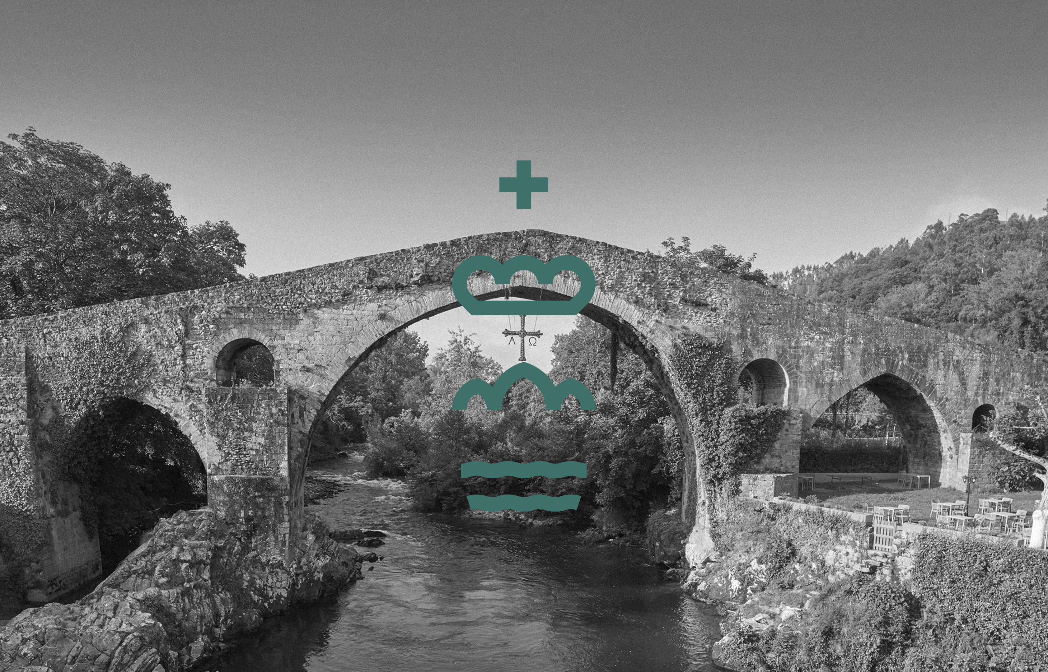
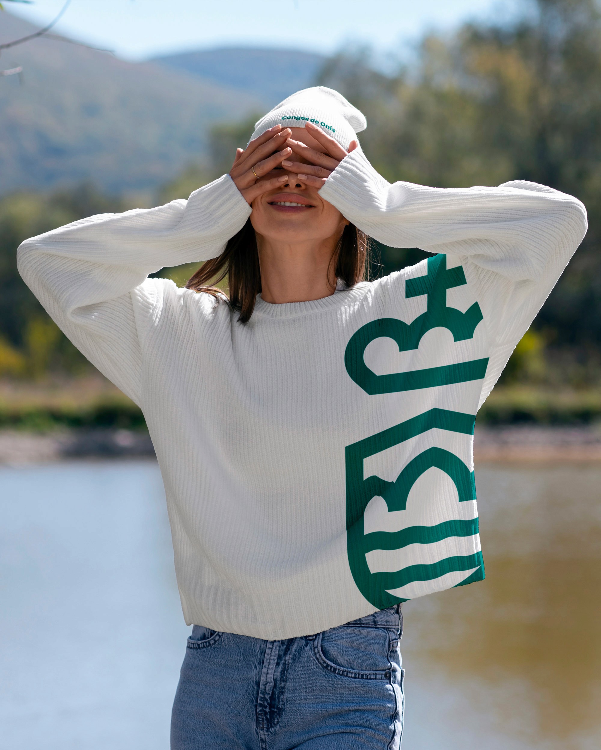
The symbol is born from the Roman Bridge: three arches that support the silhouette of Cangas and link water, stone and mountain. From this, two systems derive. The corporate one, sober and recognisable, with the crowned shield refined to function on any official medium. And the tourist one, more free and chromatic, where the arches become their own graphic language. The typography brings closeness without losing institutional solidity losing institutional strength.

A brand for the city and for those who visit it
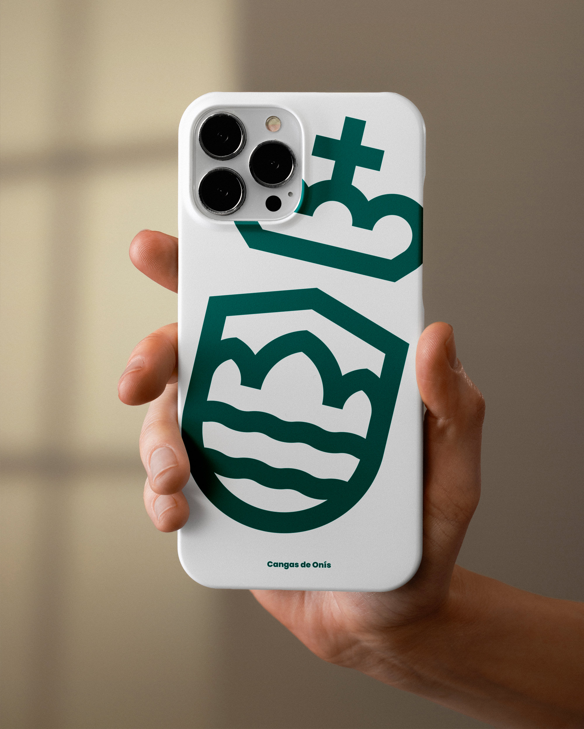
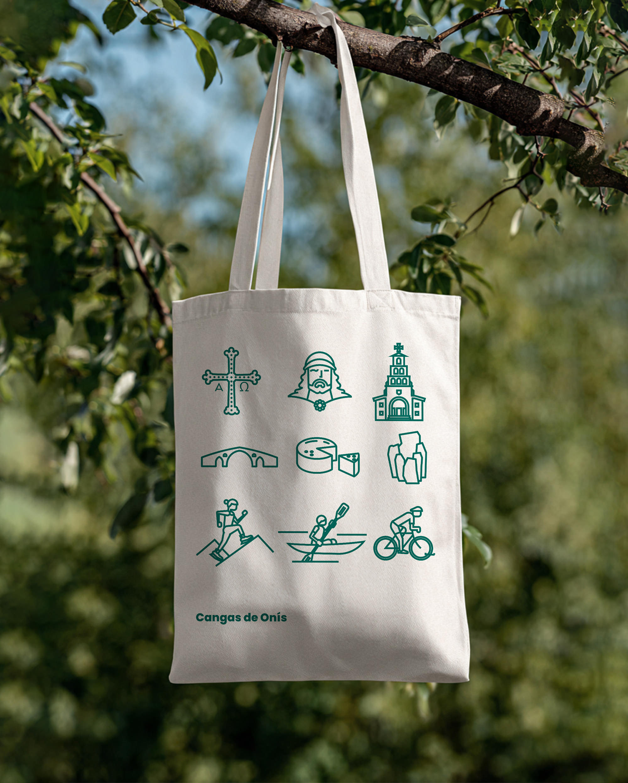
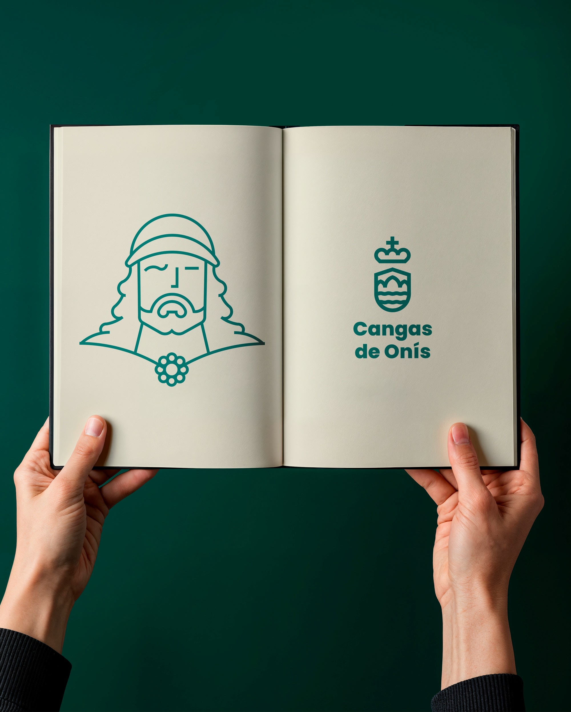
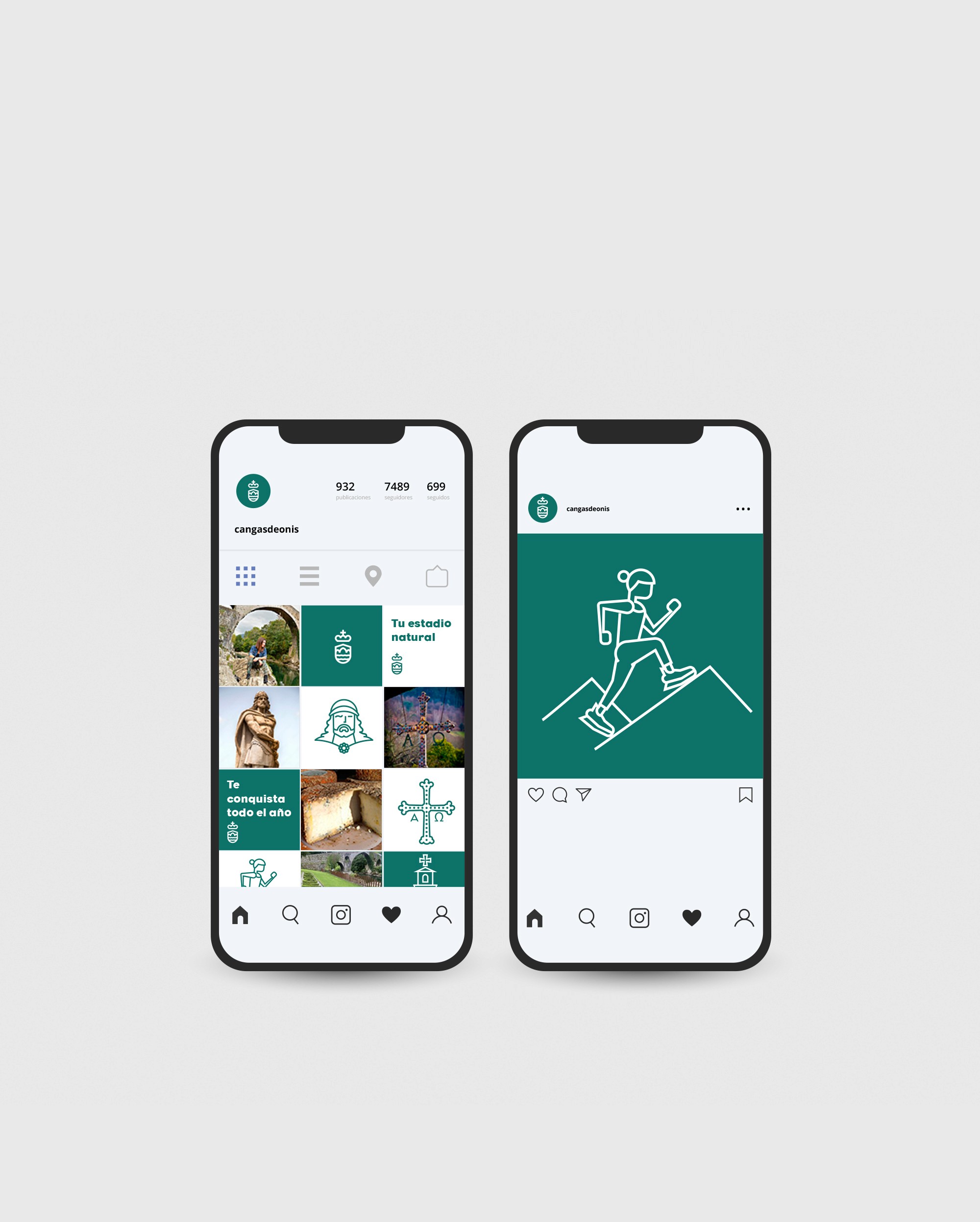
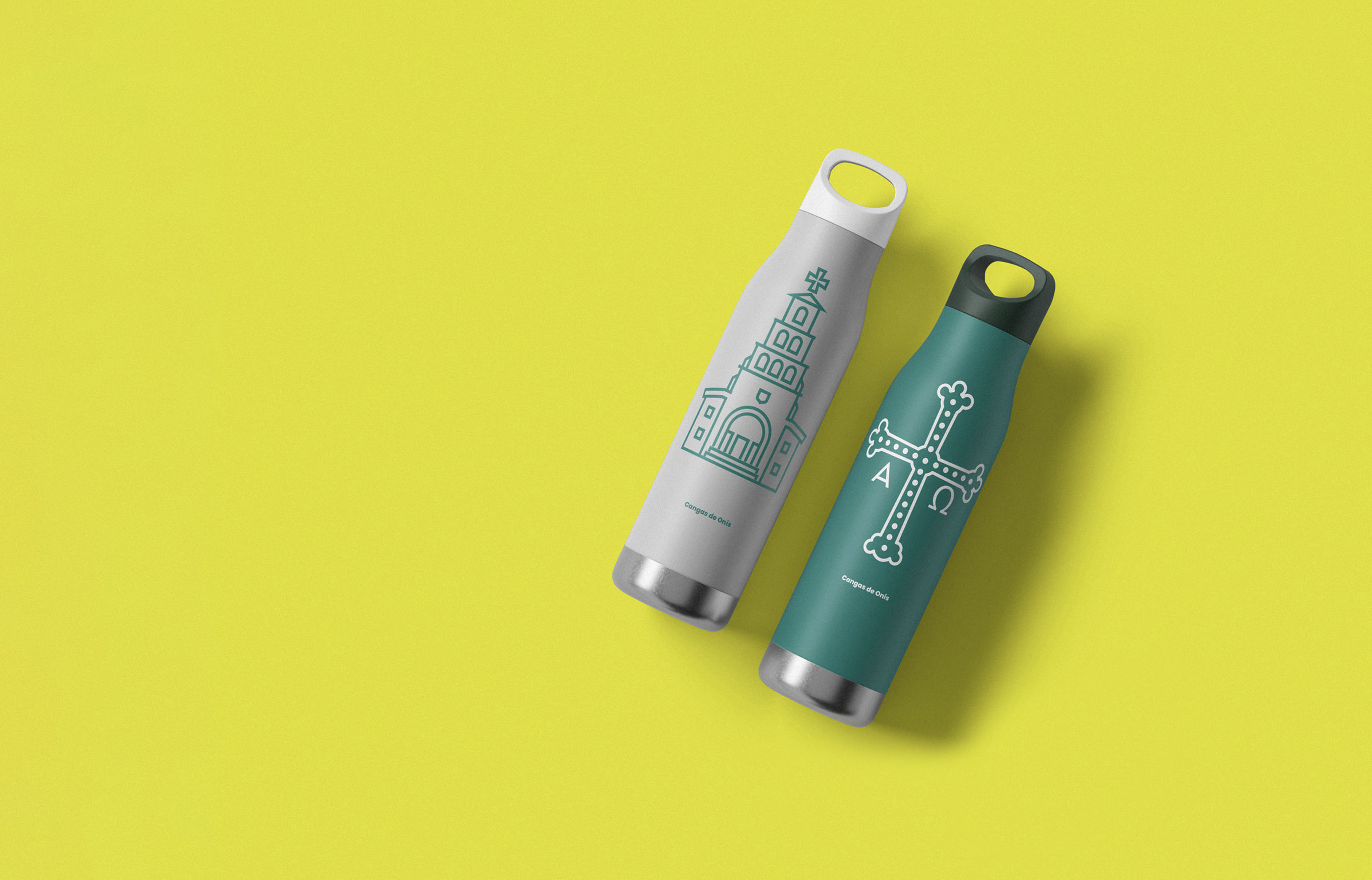
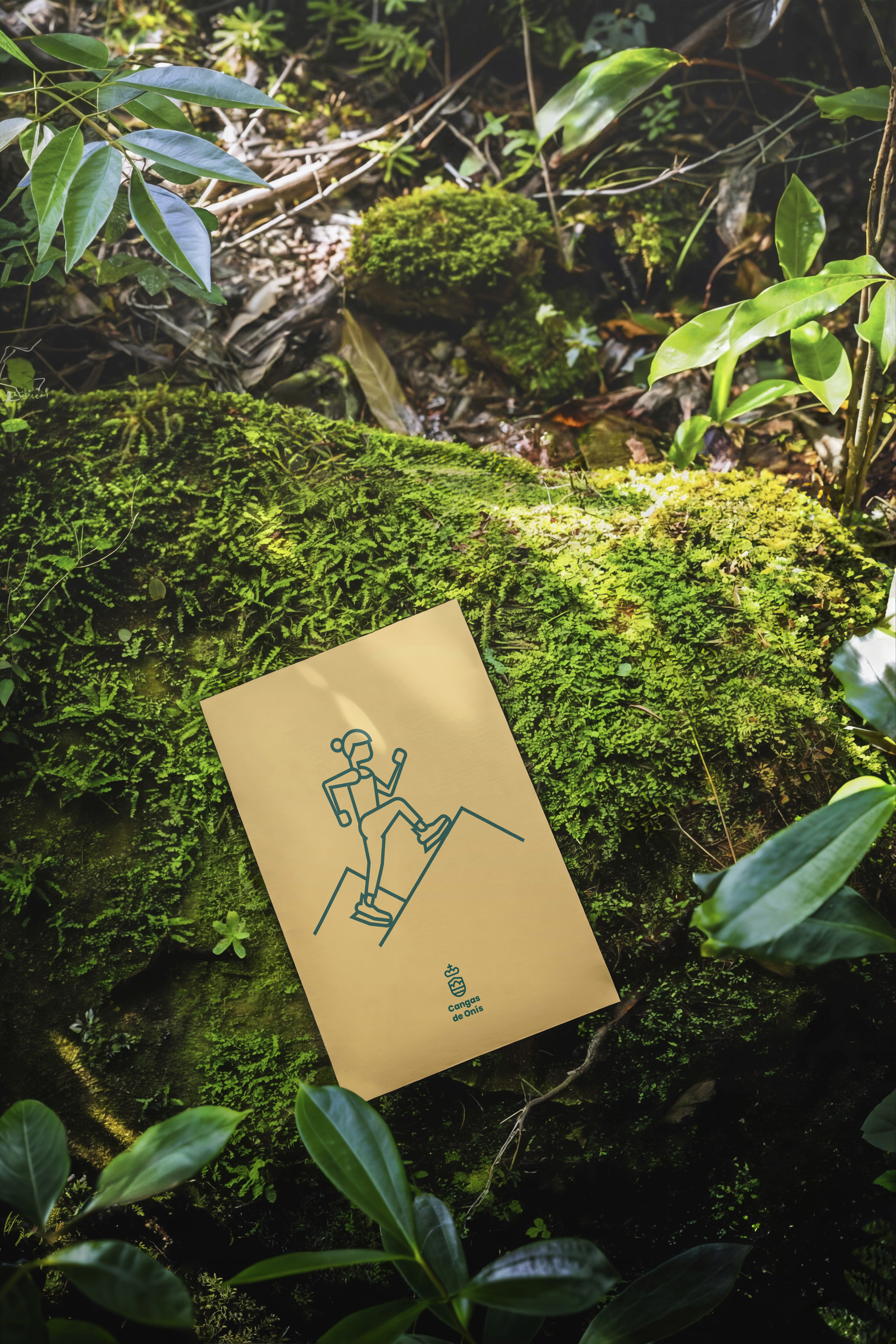
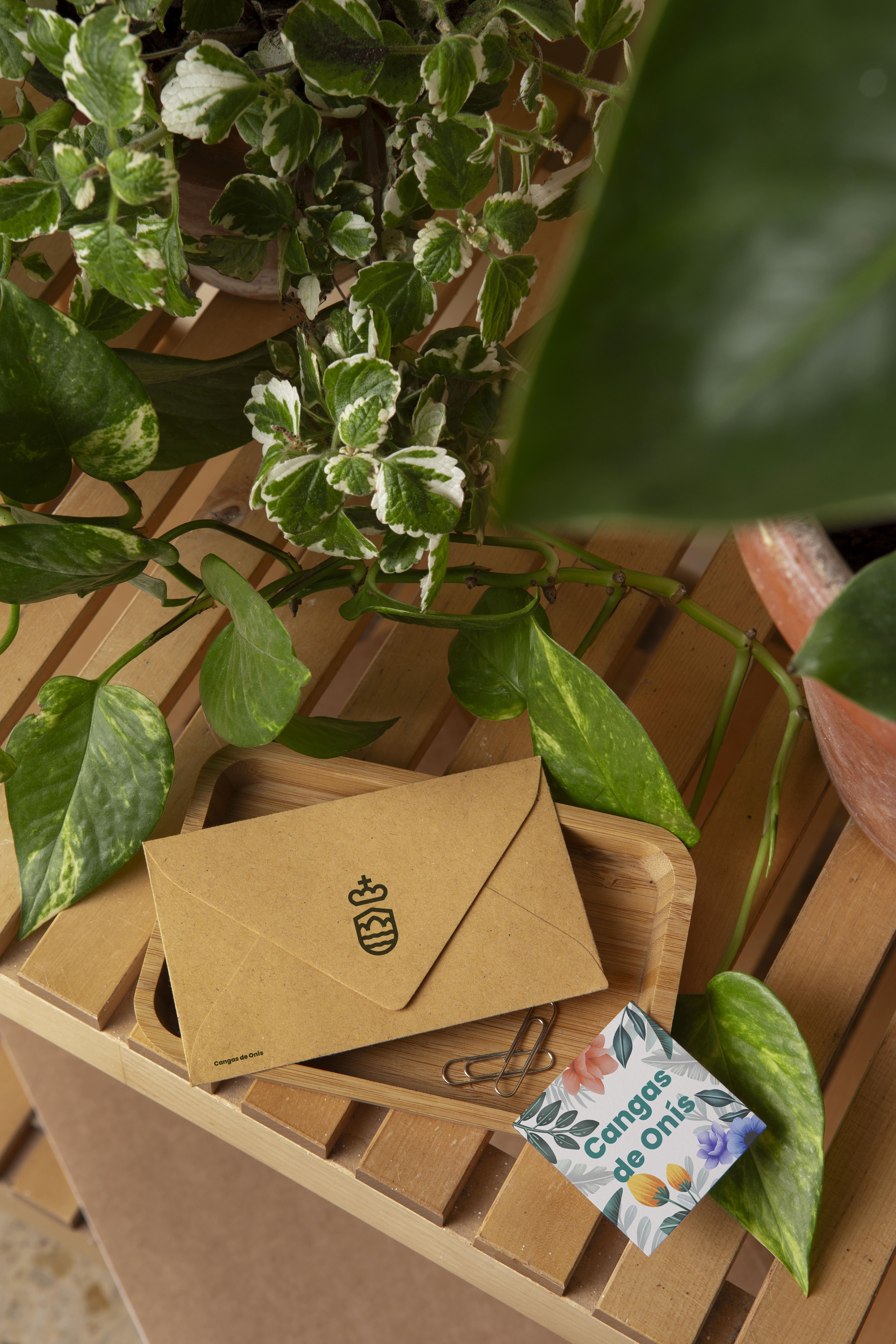
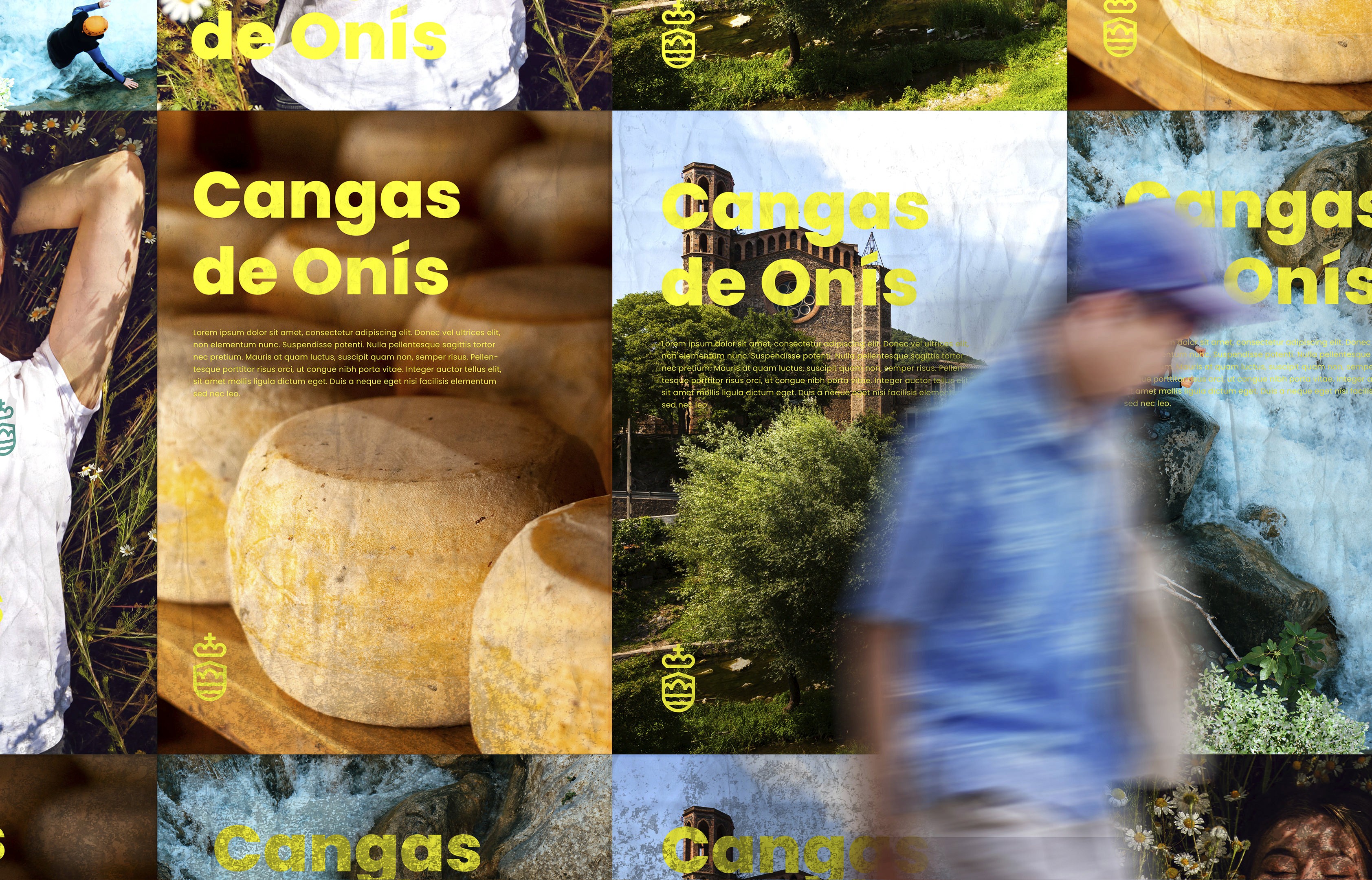
We collaborated on the development of the new identity, considering how the system would reach every touchpoint. In the corporate sphere: signage, the municipal fleet, stationery, and the various departments—Tourism, Sport, Culture—under a single signature. In terms of tourism: merchandising and proprietary channels such as social media, where the arch language and the promise "Legacy of Nature" come to life. An identity designed to last and to grow with the city, not for a single campaign.




A single voice for Cangas de Onís
From that collaboration, a coherent, versatile brand of its own was born out of the initial fragmentation. An identity that respects the history of the first capital of the Kingdom of Asturias while, at the same time, projecting it towards a conscious tourism in search of nature, culture, and authenticity.
Next case
View next project
Don Zoilo
Contents for Don Zoilo, a unique range of wines from W&H wineries.