
K2 International
Promoting language tourism.


The identity
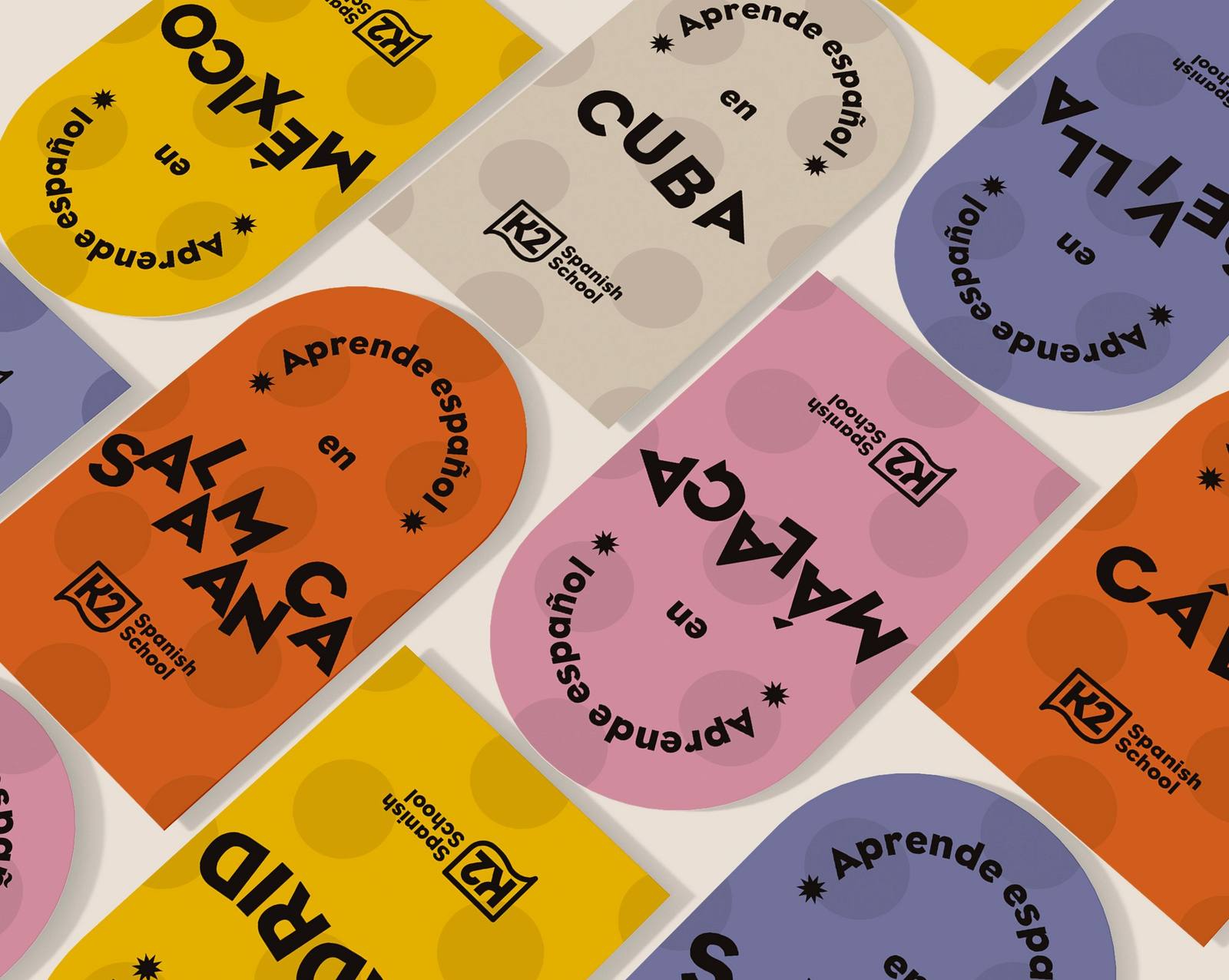
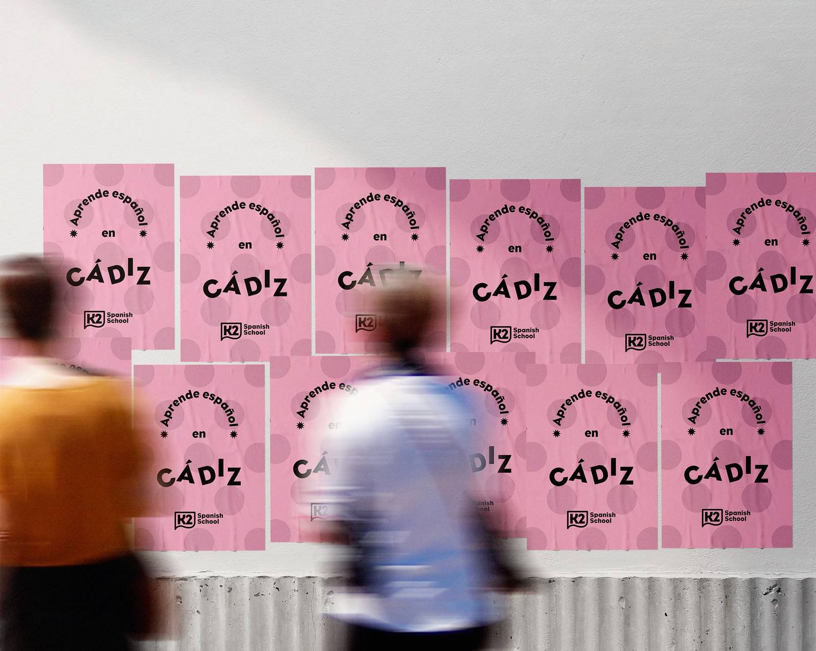
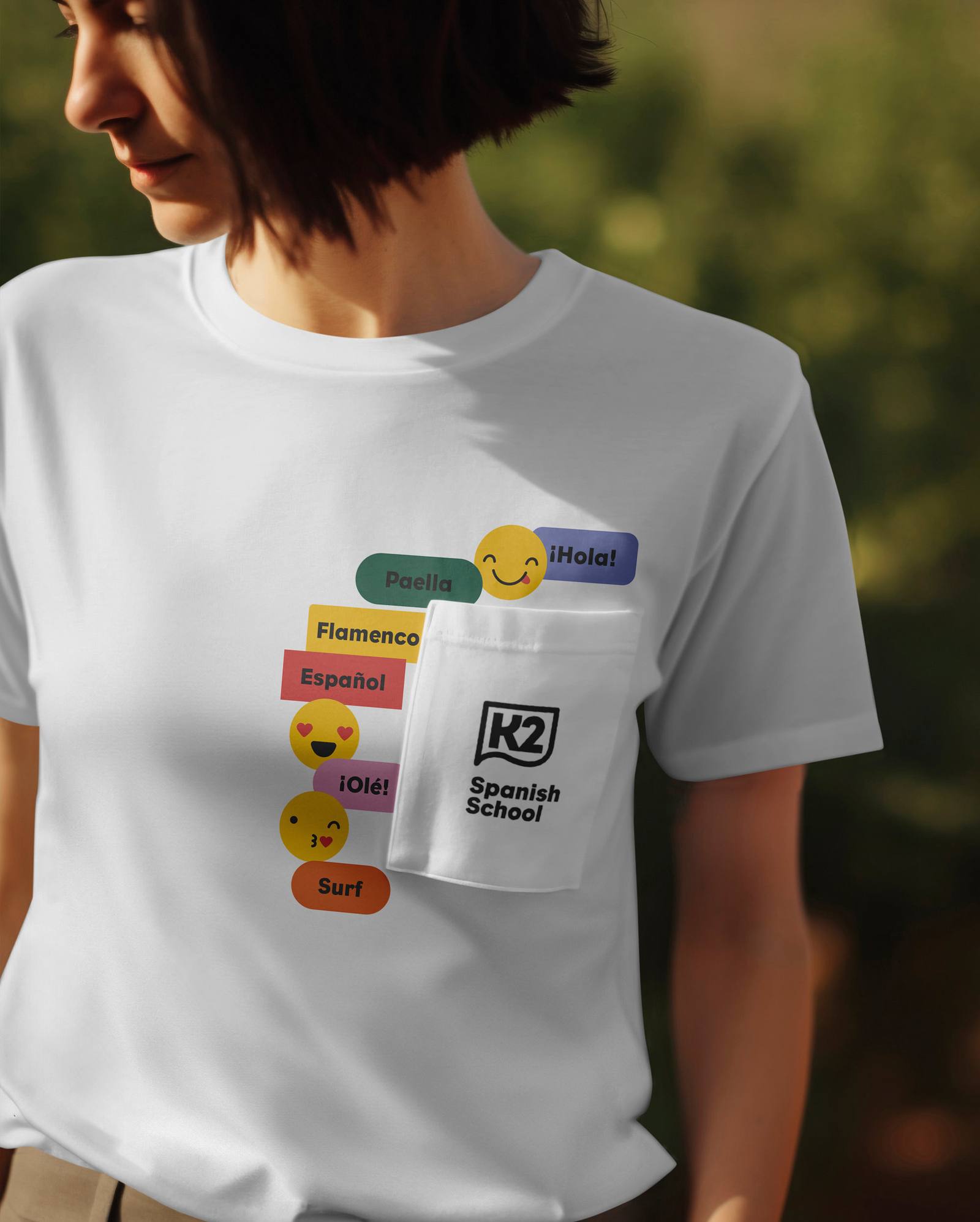
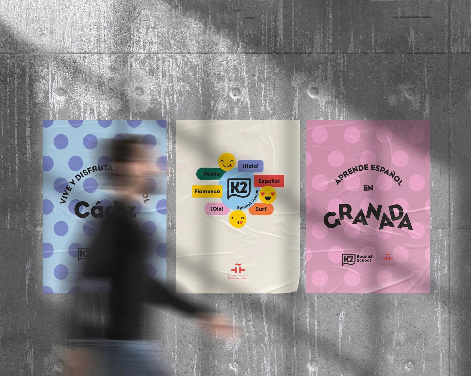
The new identity had to reflect two traits at once: the school’s youthfulness and its academic rigour.
We designed a dynamic logo that expresses movement and global connection, with a palette inspired by the blue of the sea and warm tones that bring closeness and energy.
The typography, clear and contemporary, adds solidity and ensures readability. Everything comes together in a visual system that works with the same consistency in print and in digital.



The activation
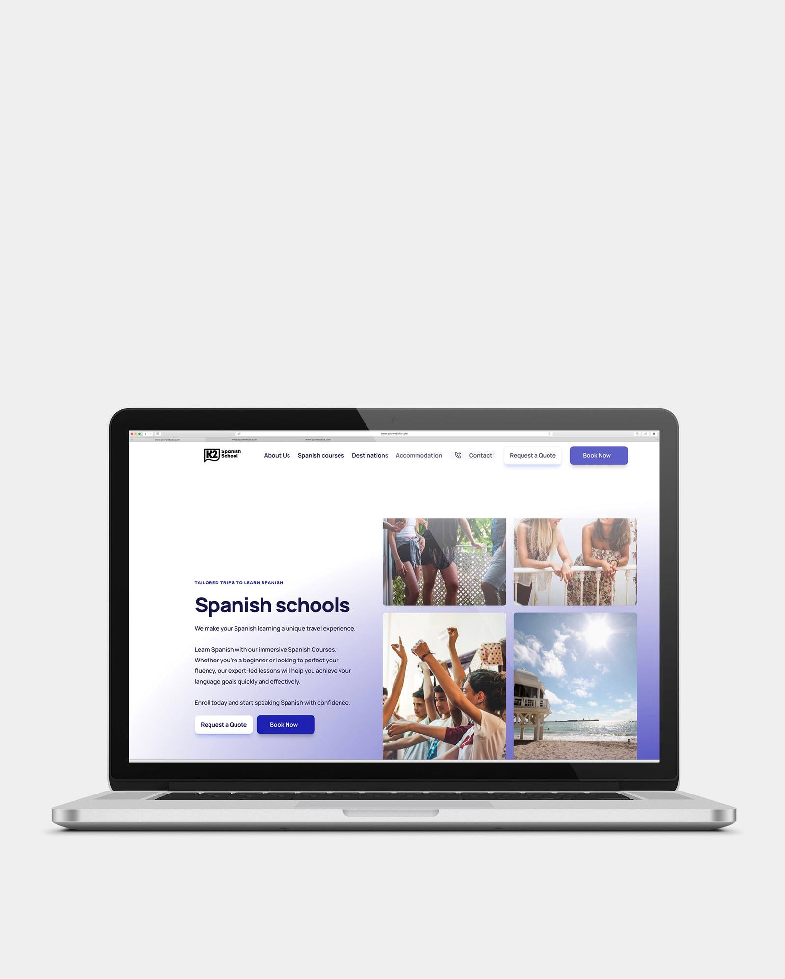
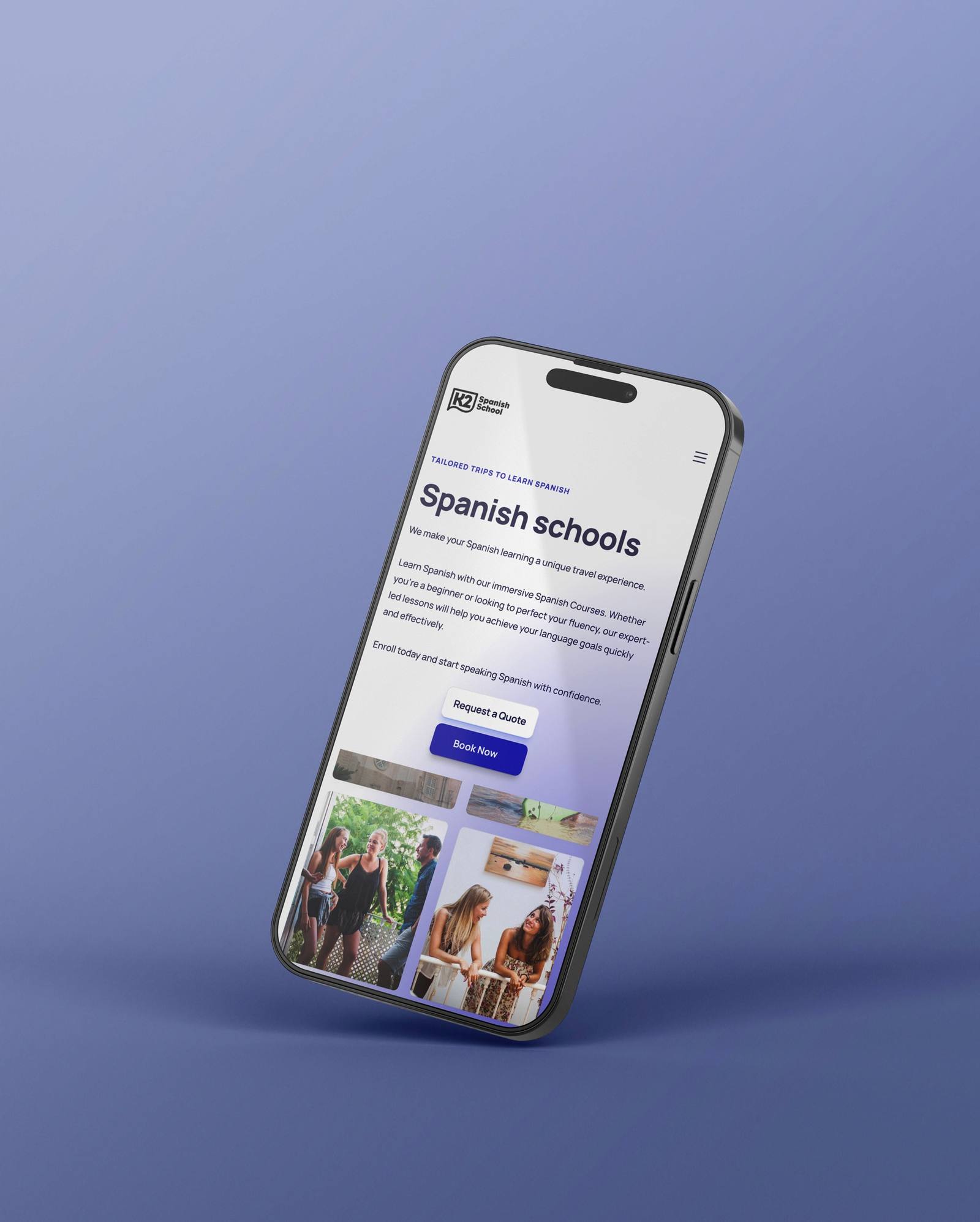
The activation focused on digital, with a complete redesign of the website. It had two goals: to reflect the new identity clearly and to turn more visitors into students.
We built it with no-code tools, giving the school a flexible platform designed for international audiences.
In parallel, we defined a content strategy to show the K2 experience beyond the classroom. It is being rolled out progressively and aims to strengthen the school’s presence on social media and other channels, building a constant bridge between the school, the city and its international community of students.




The outcome
K2 Internacional now presents itself more strongly to international audiences, with a brand that clearly explains the value of what it offers: learning Spanish by living the full experience.
The new strategy strengthens its positioning against other schools and gives it a solid foundation for attracting students from different countries.

More cases




Related ideas

We transcend through meaning
When your competition matches your features and your price ceases to be an advantage, what territory do you really compete in? The answer lies in the meaning you build around your brand—something that cannot be easily copied.

The three pillars of every brand: Strategy, Design and Content
Every brand is built and grows on three fundamental pillars: strategy, design, and content. Brand strategy is your foundation—what makes you different and why it matters.
What can a branding agency do for your brand?
Every project is a unique opportunity to discover something new, both about the brand we are working with and the process itself. The value of strategic branding goes beyond the obvious: it is about building systems that create a real and sustainable impact on the business.
Is your brand at a similar moment?
Tell us where it stands and we'll work out together where to start.