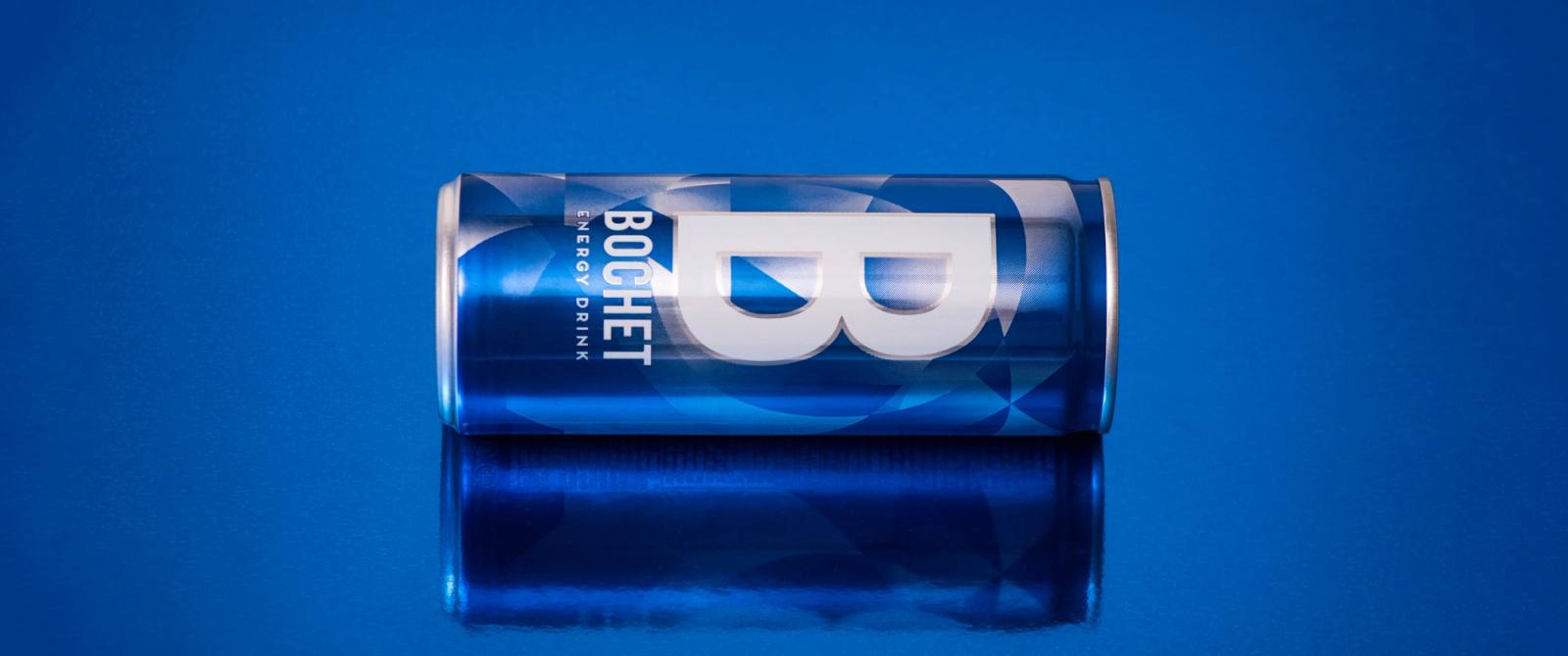
Bochet
Standing out on the energy-drink shelf
The identity
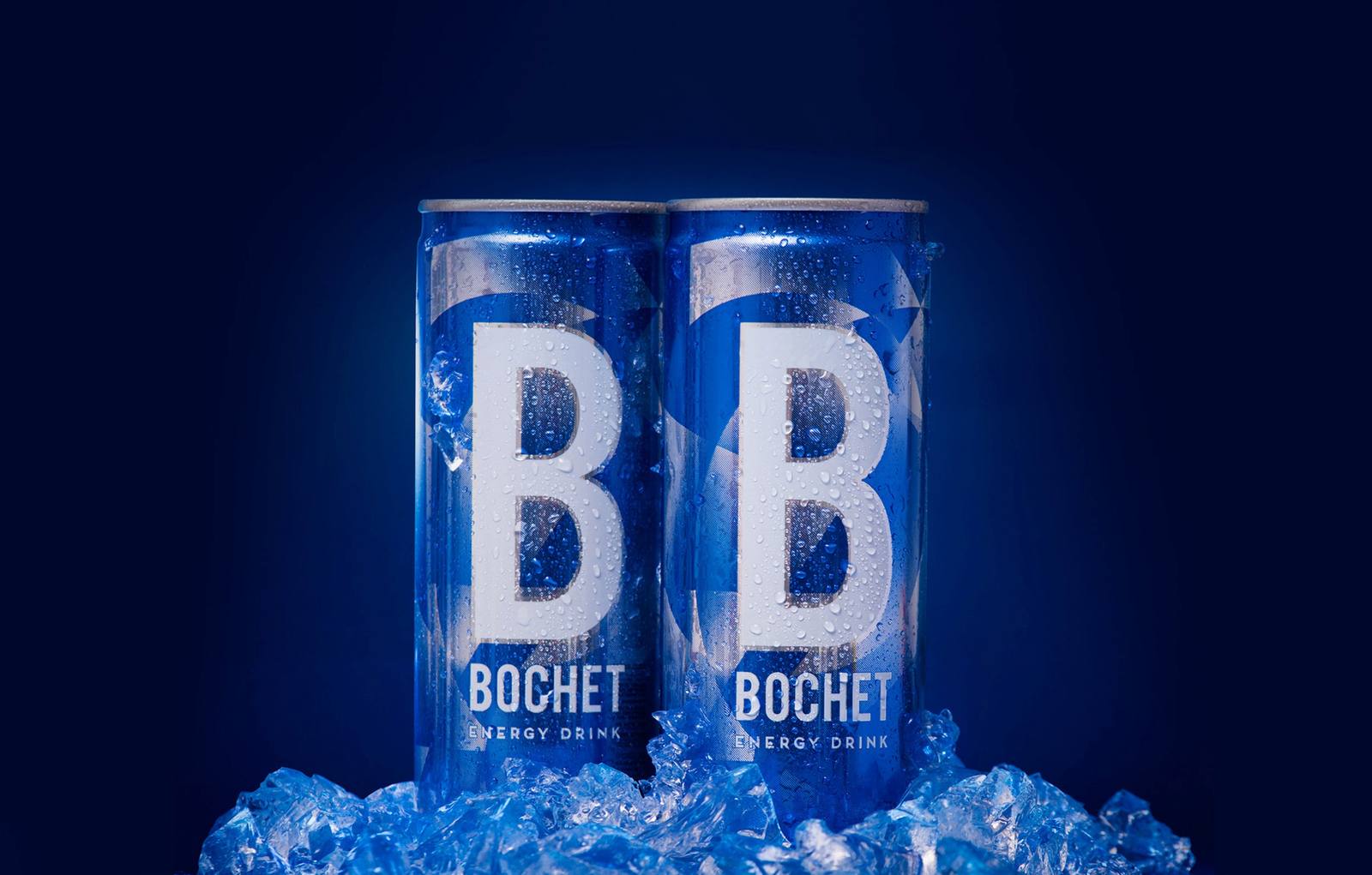
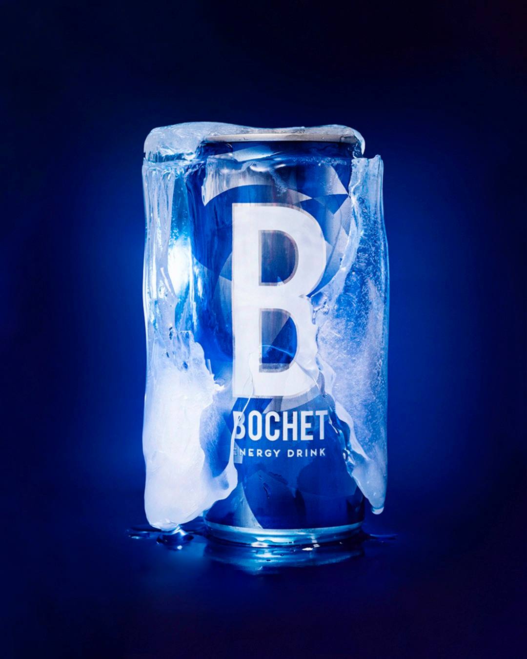
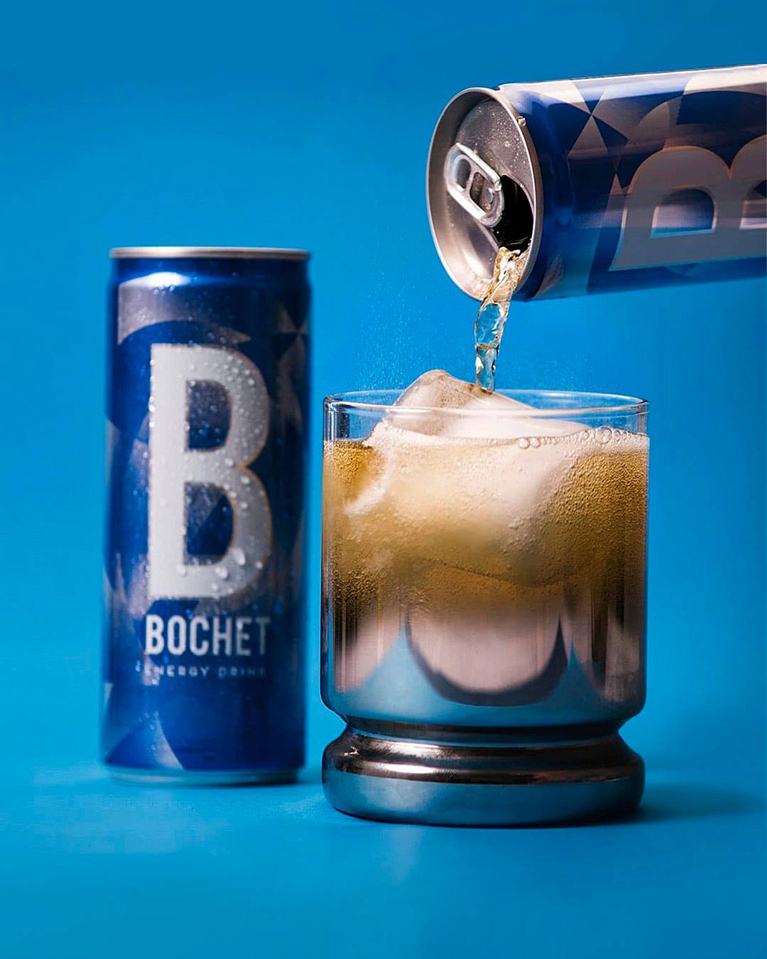
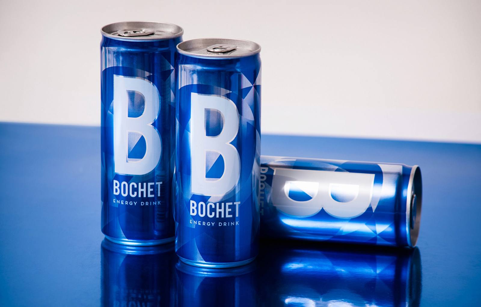
We carried those qualities into the identity and the packaging through a graphic pattern that balances the contemporary, the energetic and the elegant. A way of talking about energy without resorting to the aggressive codes typical of the category.
The pattern works as a flexible visual system: it adapts to different pack formats and extends naturally to communication materials.

The outcome
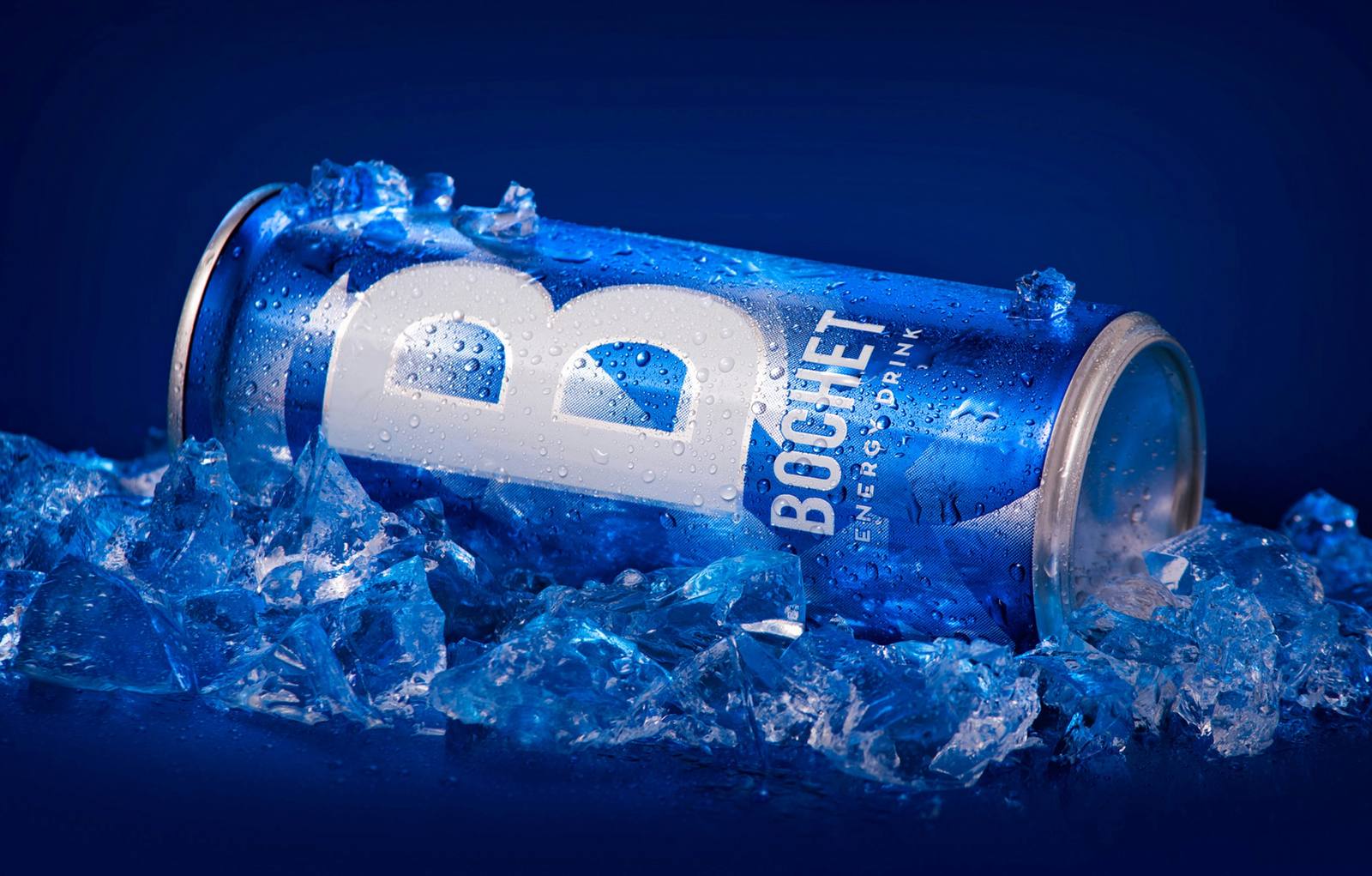
Bochet gained packaging with a personality of its own, recognisable against the competition and aligned with what makes it different: an energy drink that is also refreshing. A system ready to grow into new formats without losing consistency.
More cases

Related ideas
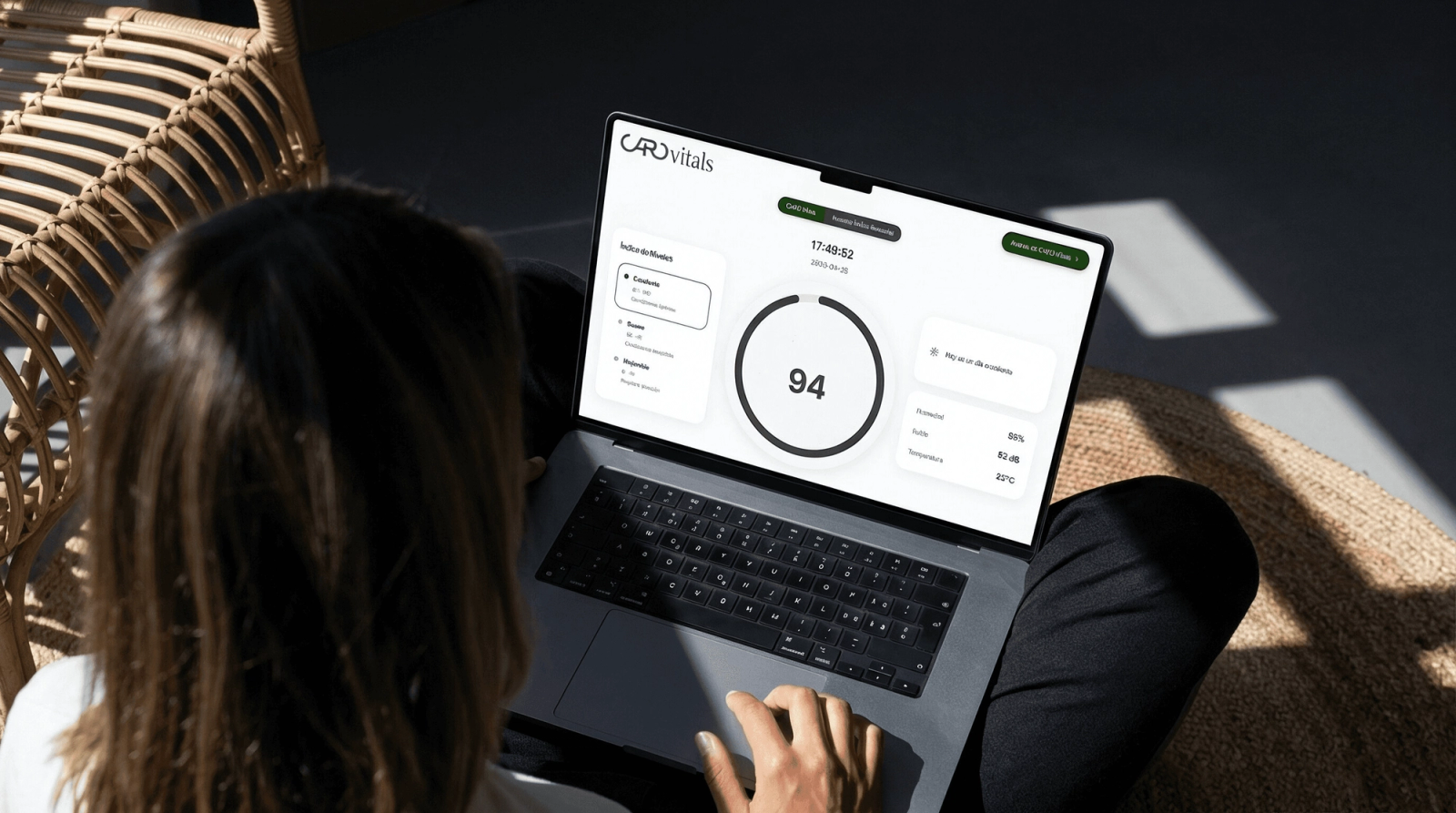
This is how we created the Caro Vitals experience at Caro Hotel.
At Fandarama, we love working on projects where design and user experience are not only seen, but felt.
How to define Brand Identity?
Your brand is much more than a logo: it is the soul of your business. A strong brand identity allows you to differentiate yourself, connect emotionally with your audience, and build loyalty. It is the authentic expression of who you are, what you represent, and how you want to be perceived.
The fundamentals of brand identity
Building a strong brand identity is essential for the success and longevity of any company, product, or service. Brand identity is not limited to simply designing an attractive identity; it involves a combination of elements that define the personality and essence of the brand.
Is your brand at a similar moment?
Tell us where it stands and we'll work out together where to start.