La Sonrisa de Tares
Taking a winery to a younger audience
The design
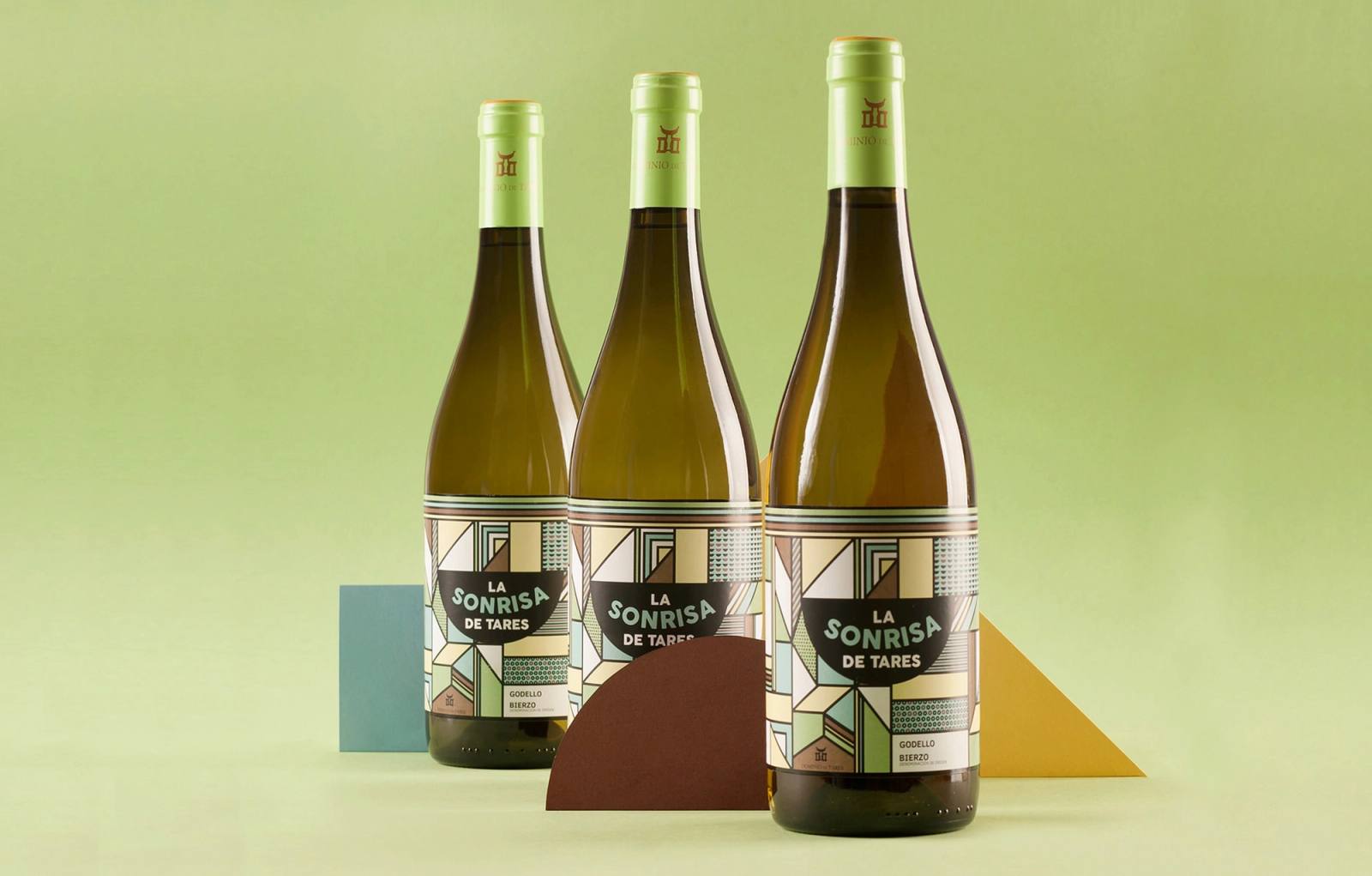
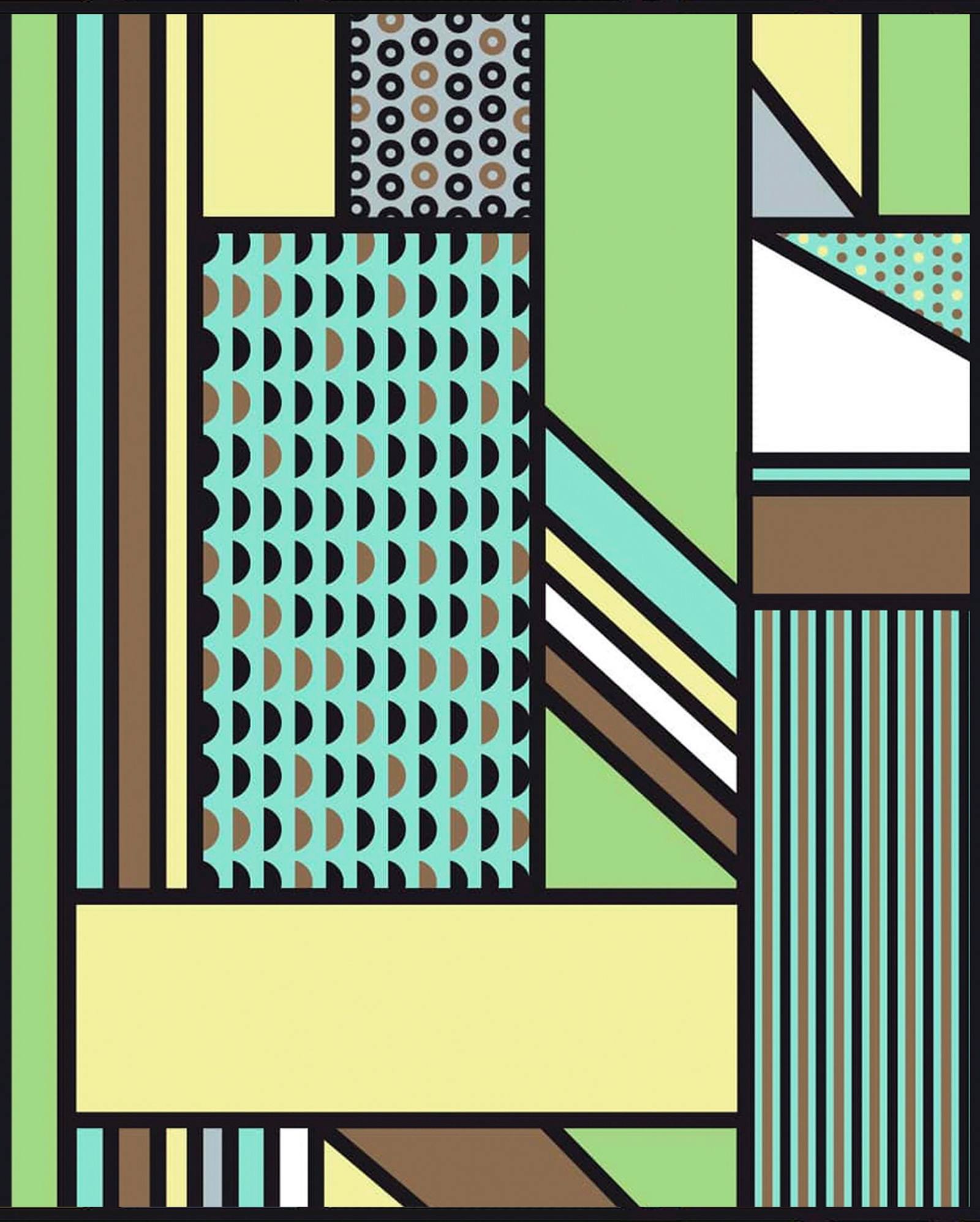
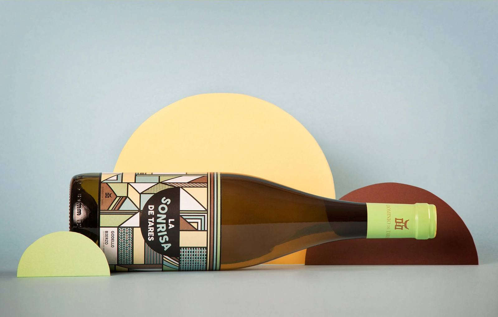
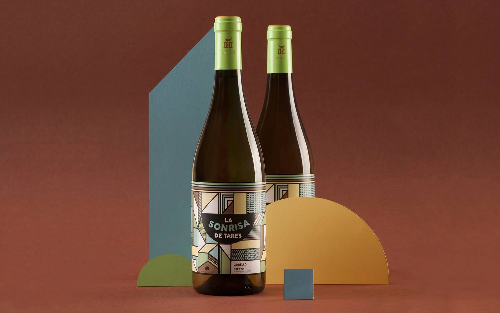
We designed the label as a kaleidoscope of images representing the vineyard, the land and the sky of the place, the elements that shape the life of this wine. The result is original, fresh and colourful packaging.
The outcome
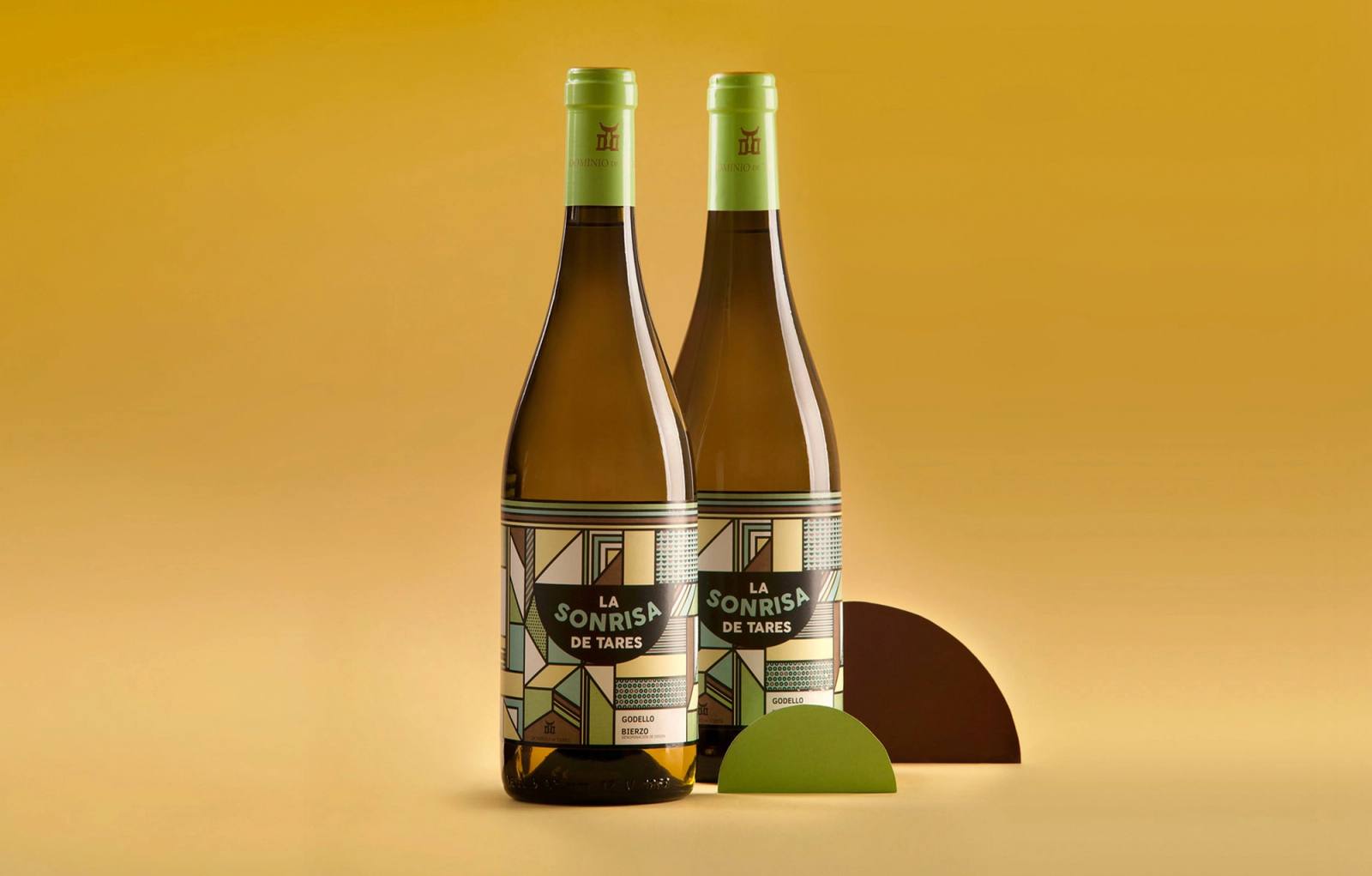
La Sonrisa de Tares reached the shelf with an image of its own, conveying the fresh character of the wine and opening the winery up to a new audience without disconnecting it from its origins.
More cases



Related ideas
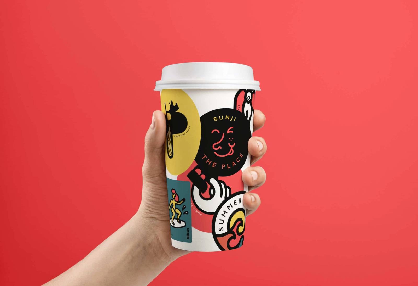
The magic of design: how visual identity boosts brands
In today's competitive world, where brands face information overload and a constant struggle for consumer attention, a strong and consistent visual identity has become more important than ever.
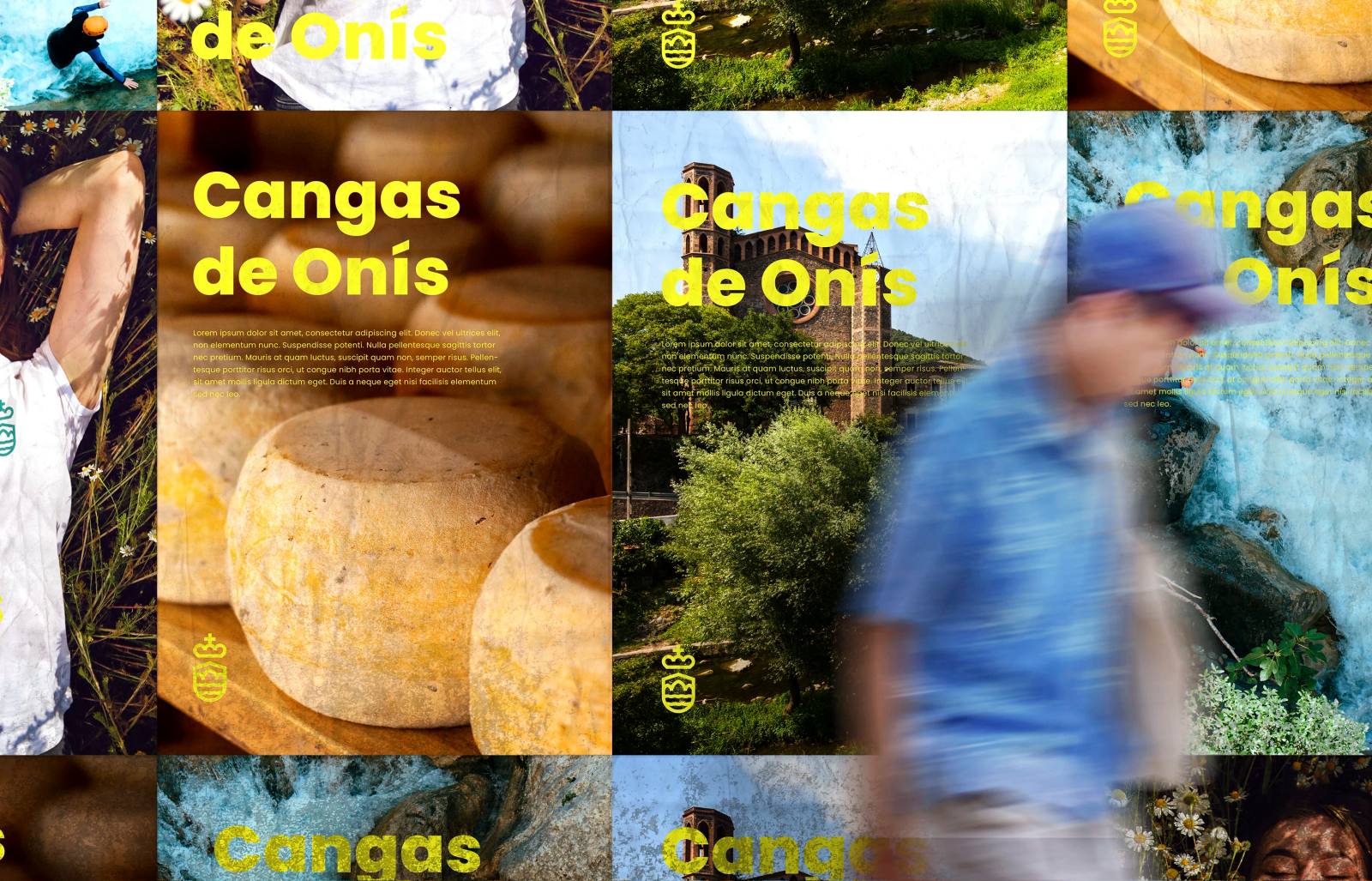
The permanence of the territory: The design of institutional identity in Cangas de Onís
Intervening in the visual identity of a municipality with a dense historical legacy is, first and foremost, an exercise in restraint and responsibility.

This is how we created the Caro Vitals experience at Caro Hotel.
At Fandarama, we love working on projects where design and user experience are not only seen, but felt.
Is your brand at a similar moment?
Tell us where it stands and we'll work out together where to start.