
Bunji, the place
Standing out in Madrid's food scene
The identity
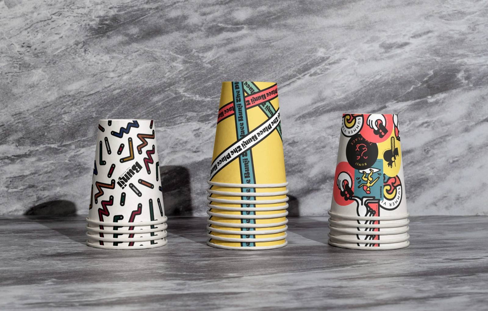
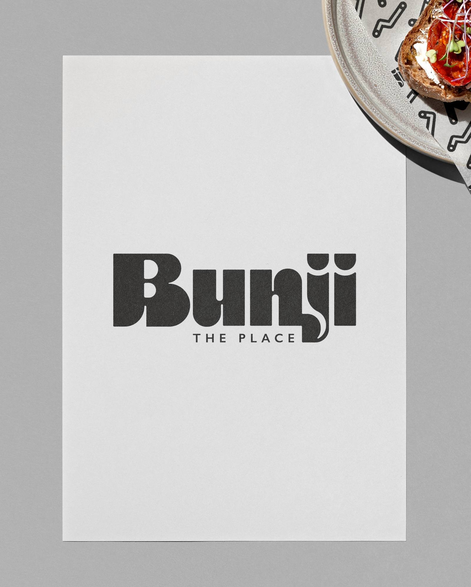
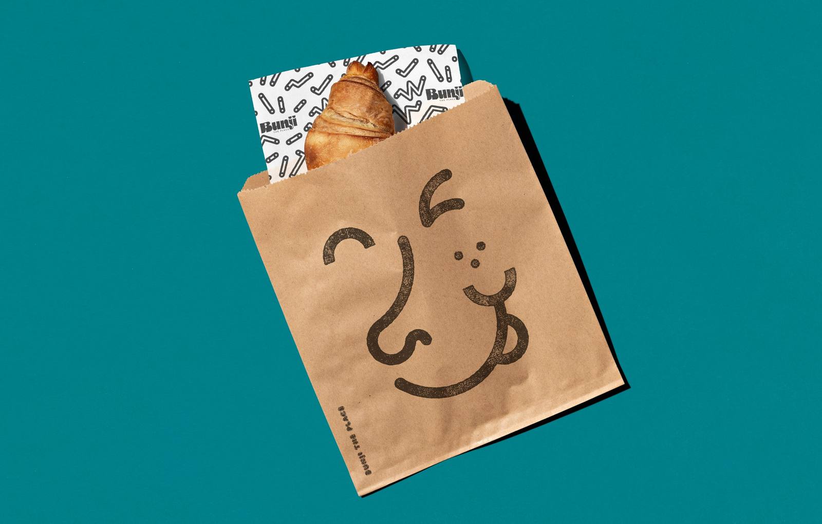
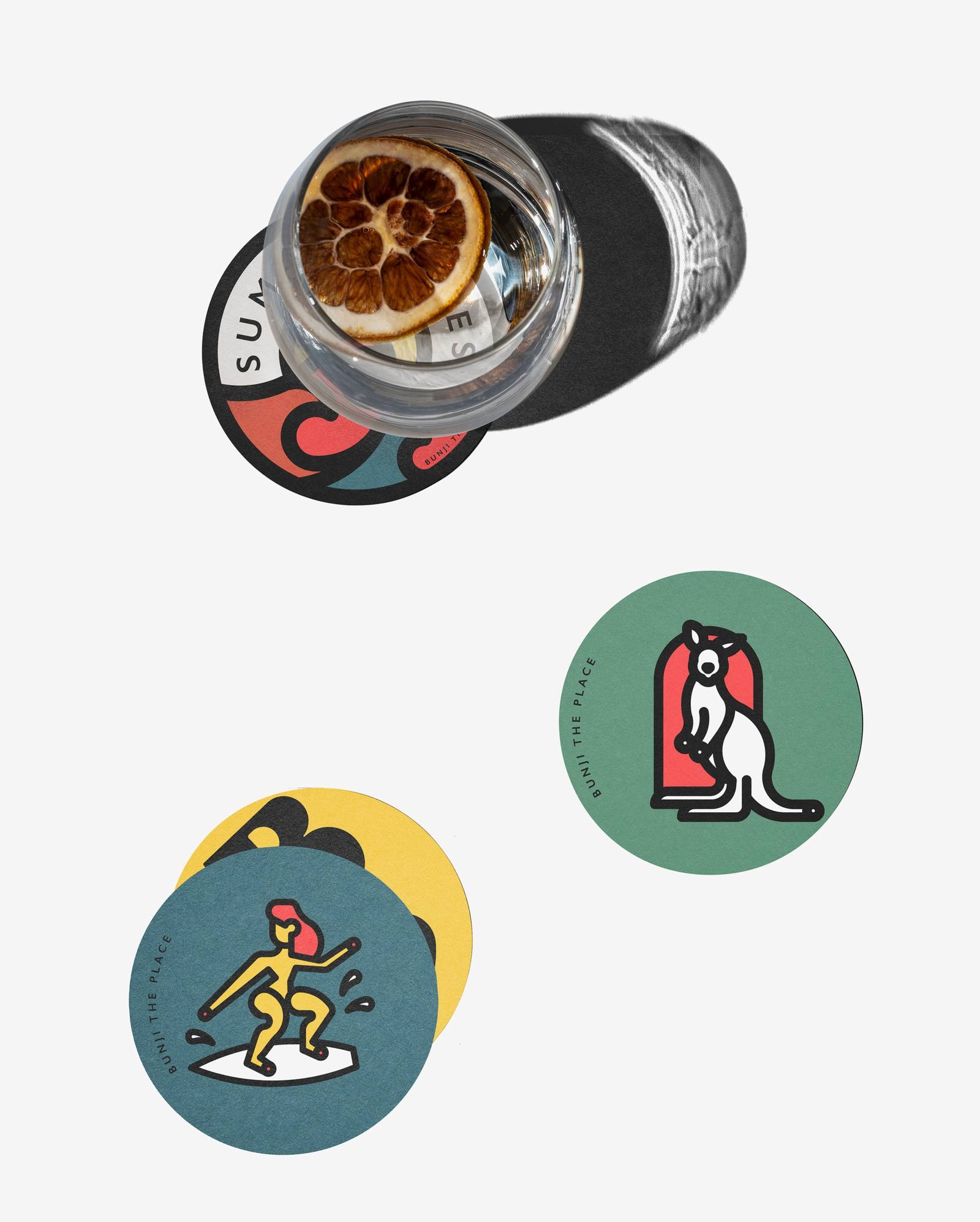
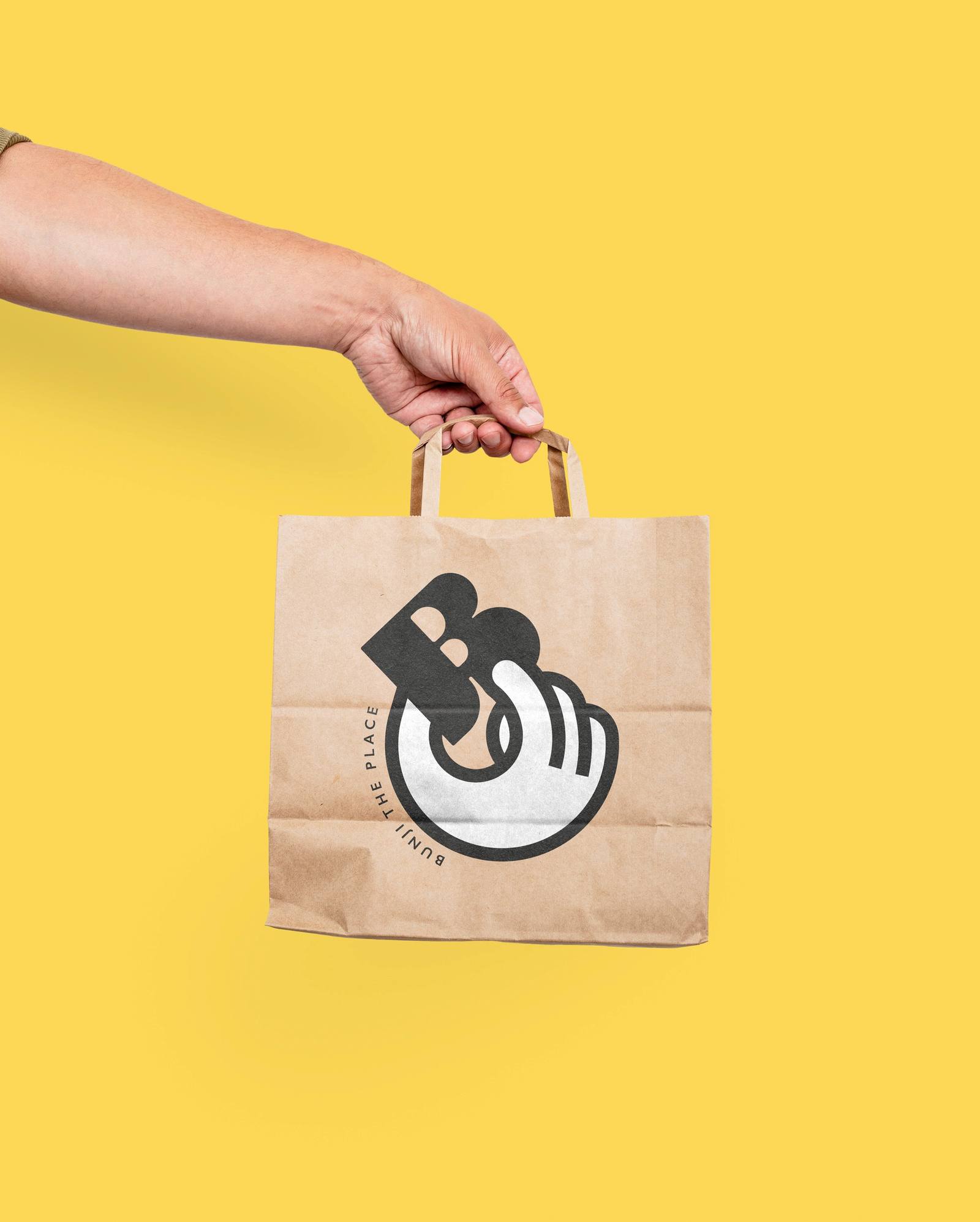
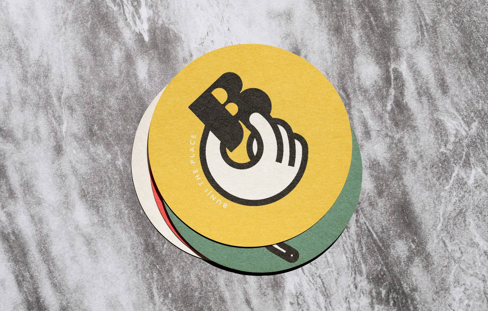
Colour became the backbone of the identity. Inspired by Australia’s lush nature, we defined a bold, vivid palette that runs through every detail of the experience and transports customers from the very first glance.
The visual language
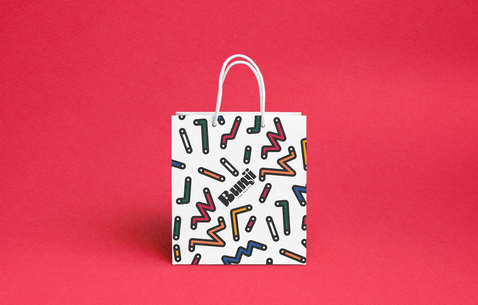
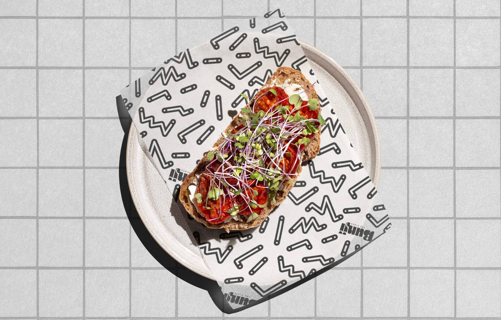
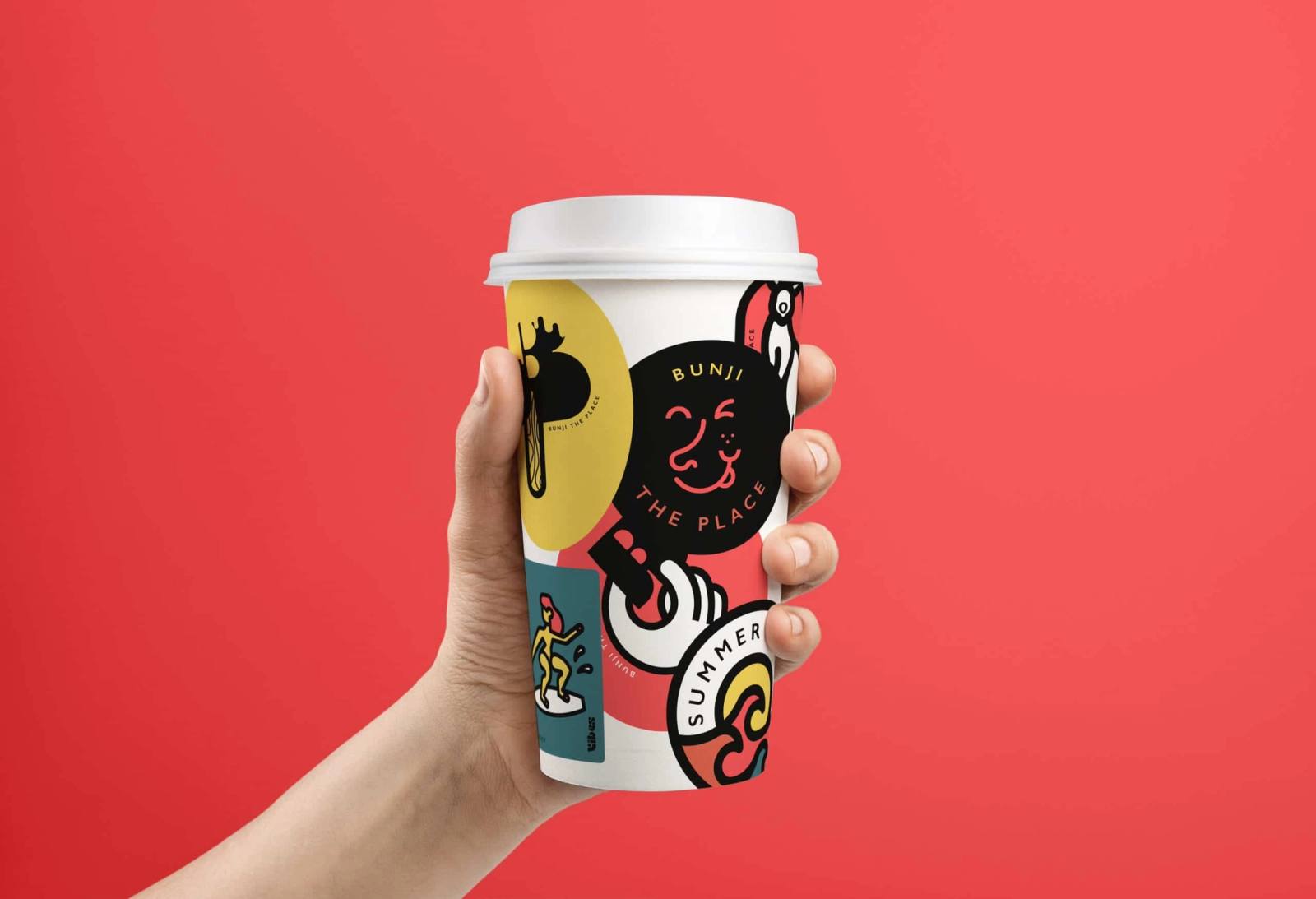
Fun is an essential part of Australian culture, and we wanted it to be present in the brand. We created a series of illustrations that form a distinctive, adaptable visual language, applied to packaging, social media and all other brand activation materials.
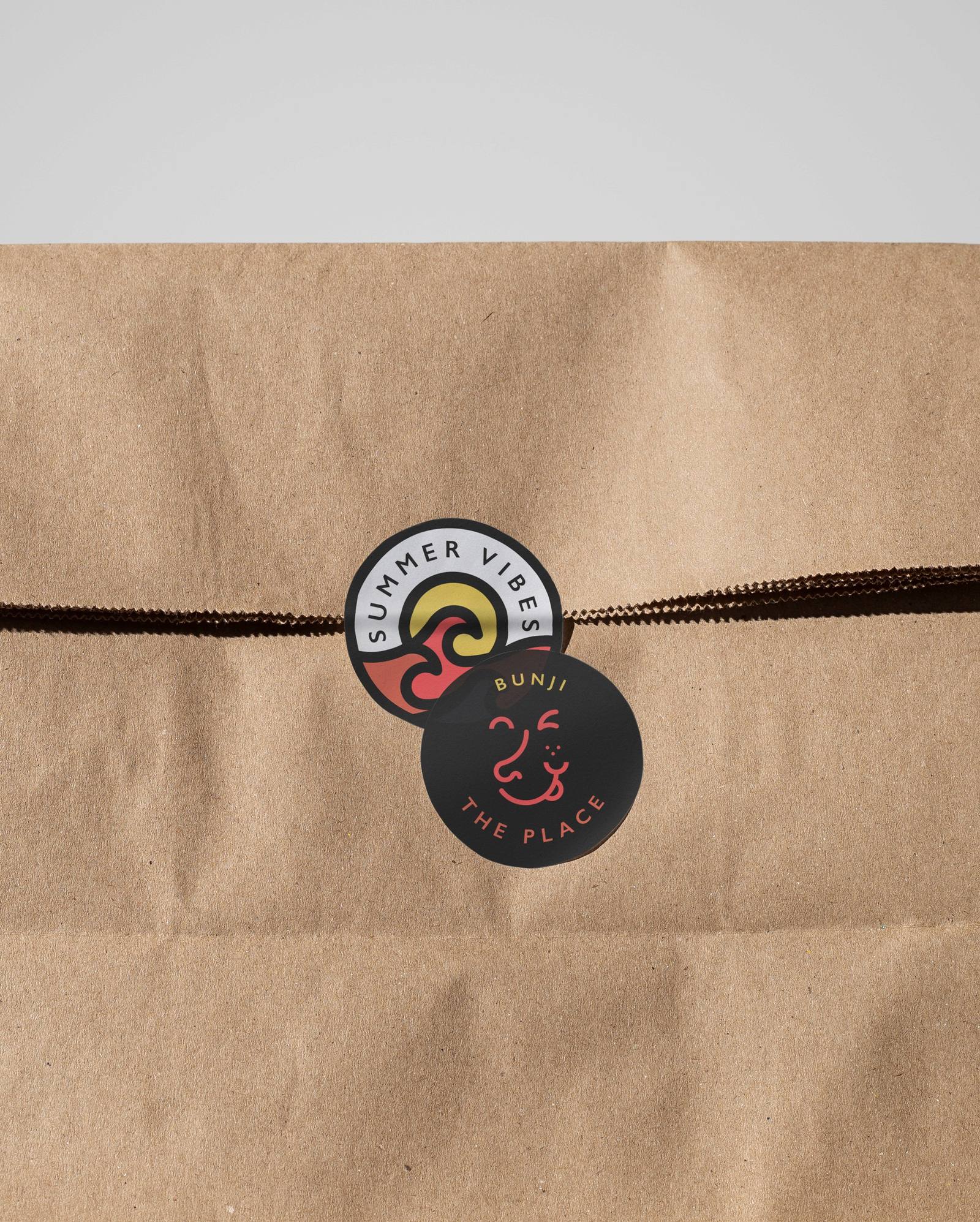
The outcome
Bunji has an identity that sets it apart in a highly competitive city. Colour and illustration give it an unmistakable language, consistent in the restaurant, on packaging and in digital, and easy to extend to new pieces.
More cases
Related ideas
The magic of design: how visual identity boosts brands
In today's competitive world, where brands face information overload and a constant struggle for consumer attention, a strong and consistent visual identity has become more important than ever.
The permanence of the territory: The design of institutional identity in Cangas de Onís
Intervening in the visual identity of a municipality with a dense historical legacy is, first and foremost, an exercise in restraint and responsibility.
This is how we created the Caro Vitals experience at Caro Hotel.
At Fandarama, we love working on projects where design and user experience are not only seen, but felt.
Is your brand at a similar moment?
Tell us where it stands and we'll work out together where to start.